With over 20 years’ experience in designing logos at Degraf, we certainly know what works and what doesn’t in creating a brand identity that will have a substantial impact on its relevant audience.
While the phrase, “simplicity is key” is used so often in so many contexts, you might say that it has become too common to make much of an impact. However, it still speaks great truth when it comes to the context of logo design and much like the phrase, a logo should not only stand the test of time but also remain highly relevant and aligned with truth no matter how often it is used or seen.
As well as simplicity, a logo should be distinctive and have the versatility to look as good in its original colours as it does in monochrome. Of course, simplicity serves in preserving such versatility and also ensuring that a logo will be easily recognised.
Our logo design process is supported by four pillars that we always consider.
Who is the logo for?
There are two aspects of this question – who the logo is to represent and who the logo is to reach. On the first side, we must consider the business offering as well as the industry and market it operates in. While creating a logo that is unique is important, adhering to certain branding expectations and conventional stylistic reference points is important to ensure its relevance. The characteristic that suits a new ice-cream brand is not going to be the same one that is appropriate for an insurance company. In addressing the audience that the logo must resonate with, we consider the demographics, and the market segment that the business is trying to reach, as well as the characteristics that the target market might expect of such a brand.
Colour
The colour palette for a logo should be eye-catching but industry-appropriate. It sets the mood of a brand. We do not follow any rules when it comes to choosing the number of colours for a logo. Some of the best logos in the history of branding were drawn from a polychromatic colour palette. Keeping that in mind, even the most colourful logos must make the same impact in a black or white version in today’s digital age and therefore, shape and composition carry at least as much weight as the choice of colour.

Stylistic Harmony
A logo is usually composed of an image or symbol and the name of the brand it represents. Therefore, the typography and choice of lettering must be balanced with the shape, size and placement of the graphic design.
Communication
In being the most concise visual representation of a brand, a logo should express its true essence. A strong logo design will help people understand what a brand does as much as what it values.
A logo’s purpose is to create a connection between a brand and its audience in by making a single compact impression. On first impression, it must be instantly memorable and on the second, it must be instantly recognised. Ultimately, it is the thinking behind a logo design that will help it shine but it is simplicity that will help its impact last.
“The simpler a logo, the more longevity it has. Simplicity makes it timeless and memorable.”
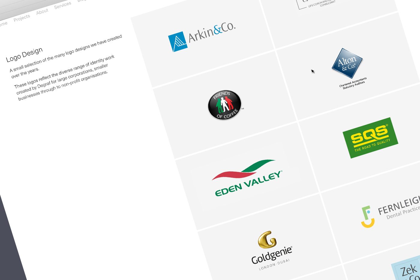
Check out some of the logos we have designed for our clients.
If you are thinking about a new logo or brand refresh, we would love to hear about your business and ideas and see how we could help you make an impact. Do not hesitate to contact us if you’d like to discuss your logo requirements.